Usability heuristics for user interface design
The 10 basic principles for designing a good user experience have remained true for decades since they were introduced for the heuristic evaluation of user interfaces.
— Bora

Design heuristics are rules of thumb or principles for design based on empirical and research-informed best practices. Some design heuristics include the famous heuristics for interface design of Jakob Nielsen and the lesser-known cognitive engineering principles of Gerhardt-Powals.
Jakob Nielsen is a renowned user experience expert who has contributed significantly to the field of human-computer interaction. He has proposed ten general principles for interaction design that are widely used as a framework for designing user-friendly interfaces.
He originally developed the heuristics for heuristic evaluation in collaboration with Rolf Molich in 1990. Four years later, he refined the heuristics based on a factor analysis of 249 usability problems [Nielsen 1994a] to derive a set with maximum explanatory power, resulting in this revised set of heuristics [Nielsen 1994b].

In 2020, NNg updated the heuristics, adding more explanations, examples, and related links. While they slightly refined the language of the definitions, the 10 heuristics have remained relevant and unchanged since 1994. When something has remained true for 26 years, it will also apply to future generations of user interfaces.
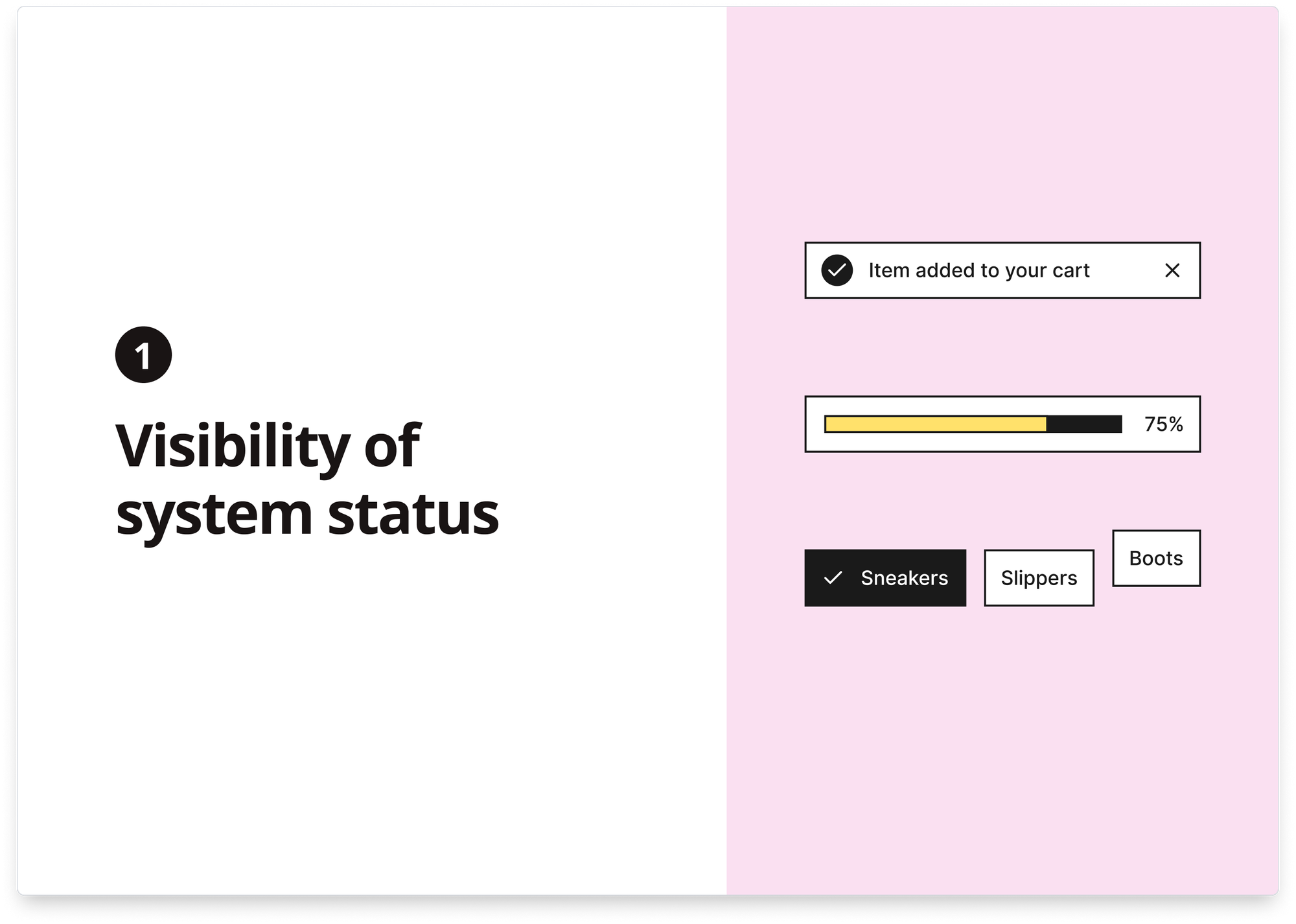
1) Visibility of system status
The design should always inform users about what is happening through appropriate feedback within a reasonable time.
When users know the current system status, they learn the outcome of their prior interactions and determine the next steps. Predictable interactions create trust in the product and the brand.
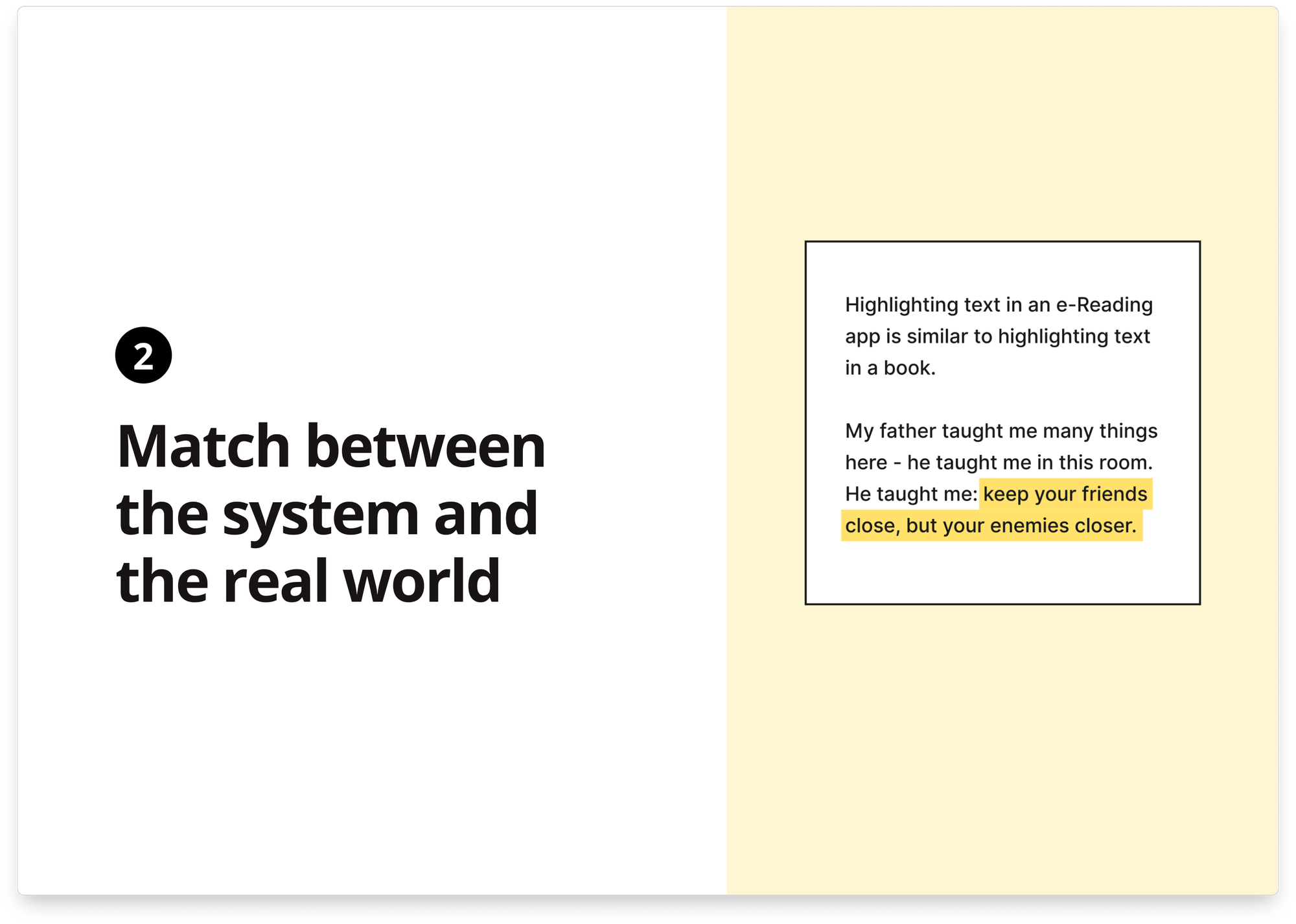
2) Match between the system and the real world
The design should speak the users’ language. Use words, phrases, and concepts familiar to the user rather than internal jargon. Follow real-world conventions, making information appear in a natural and logical order.
The way you should design depends very much on your specific users. Terms, concepts, icons, and images that seem clear to you and your colleagues may be unfamiliar or confusing to your users.
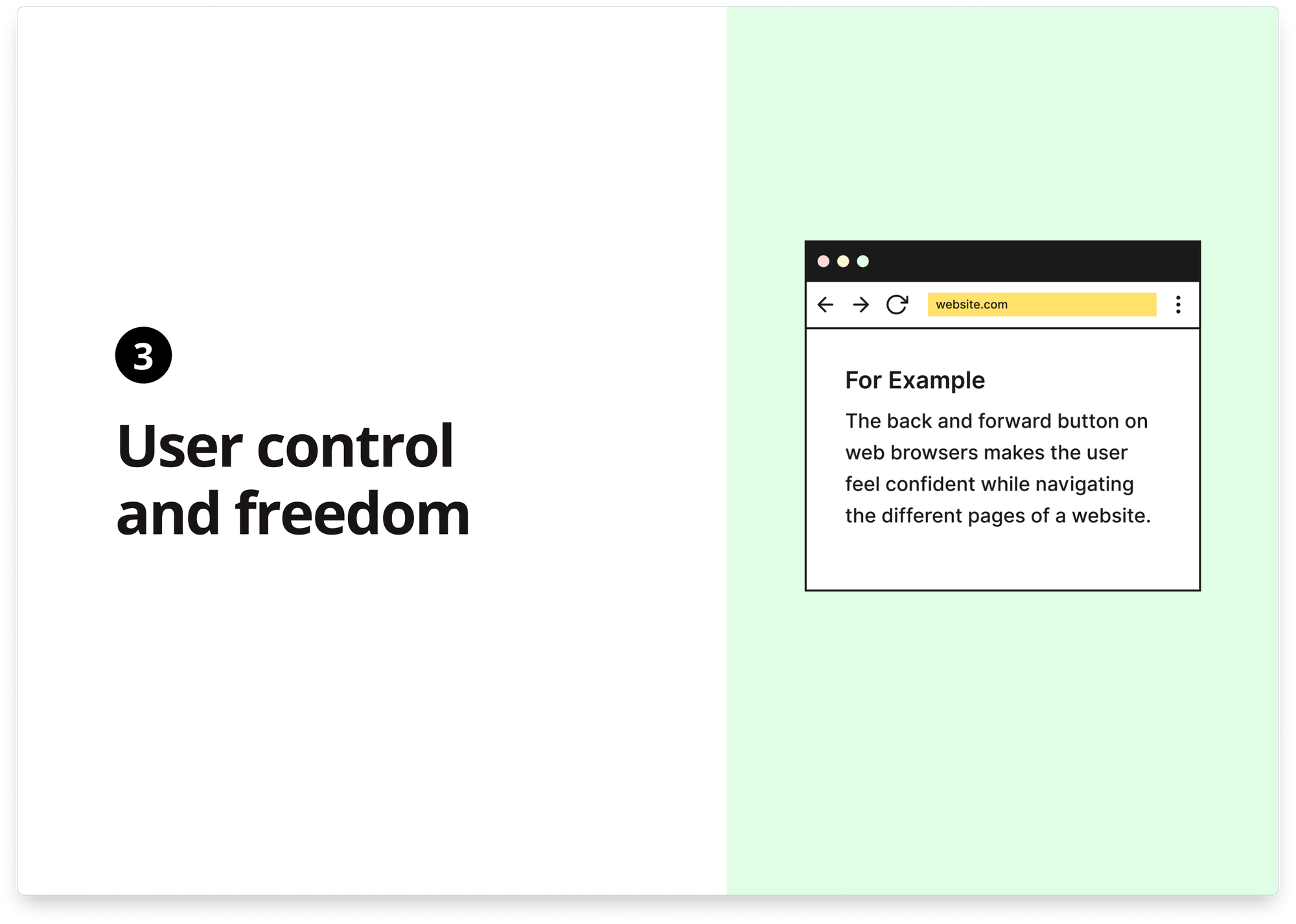
3) User control and freedom
Users often perform actions by mistake. They need a marked “emergency exit” to leave the unwanted action without going through an extended process.
When it’s easy for people to back out of a process or undo an action, it fosters a sense of freedom and confidence. Exits allow users to control the system and avoid getting stuck and frustrated.
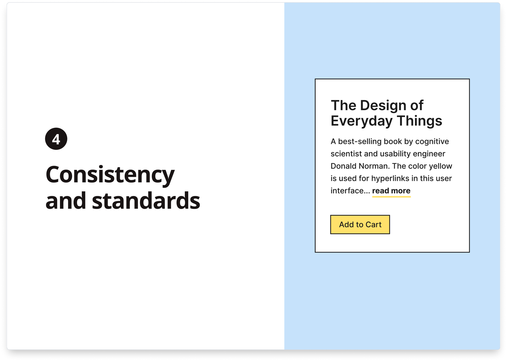
4) Consistency and standards
Users should not wonder whether different words, situations, or actions mean the same thing. Instead, they should follow platform and industry conventions.
Jakob’s Law states that people spend most of their time using digital products other than yours. Users’ experiences with those other products set their expectations. Failing to maintain consistency may increase the users’ cognitive load by forcing them to learn something new.
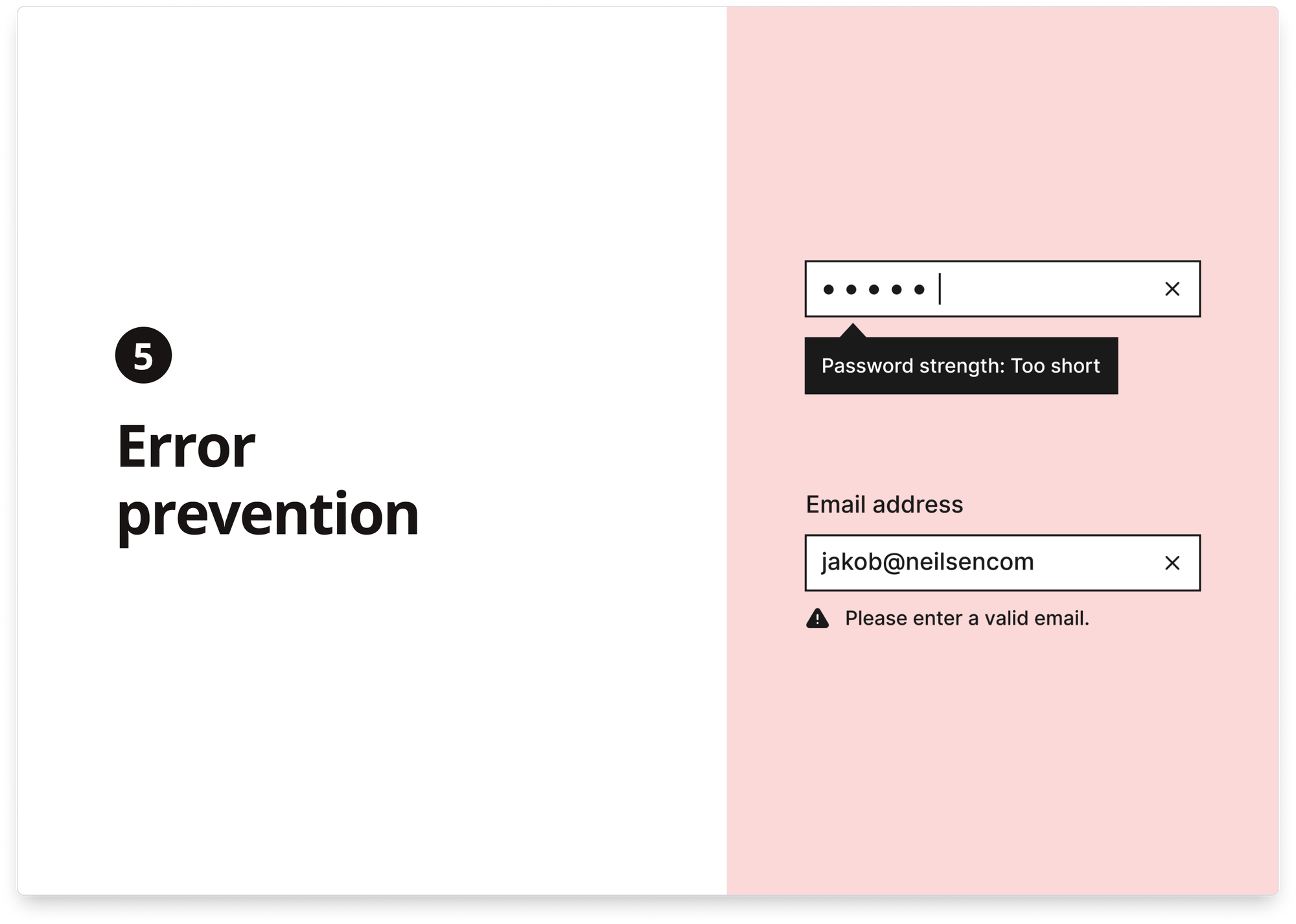
5) Error prevention
Good error messages are essential, but the best designs carefully prevent problems from occurring. Either eliminate error-prone conditions or check for them, and present users with a confirmation option before they commit to the action.
There are two types of errors: slips and mistakes. Slips are unconscious errors caused by inattention. Mistakes are conscious errors based on a mismatch between the user’s mental model and the design.
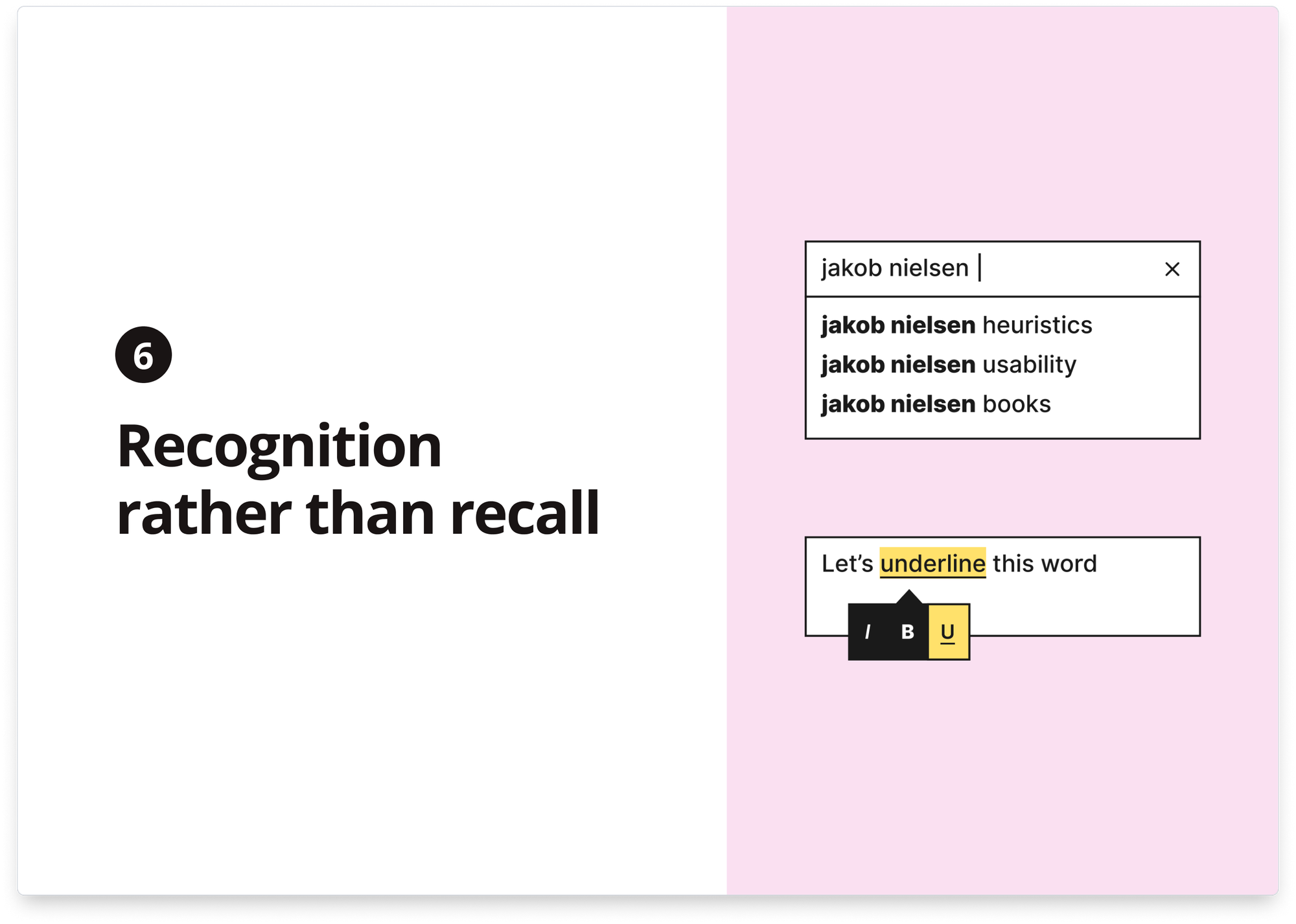
6) Recognition rather than recall
Minimize the user’s memory load by making elements, actions, and options visible. The user should not have to remember information from one part of the interface to another. Information required to use the design (e.g., field labels or menu items) should be visible or easily retrievable when needed.
Humans have limited short-term memories. Interfaces that promote recognition reduce the amount of cognitive effort required from users.
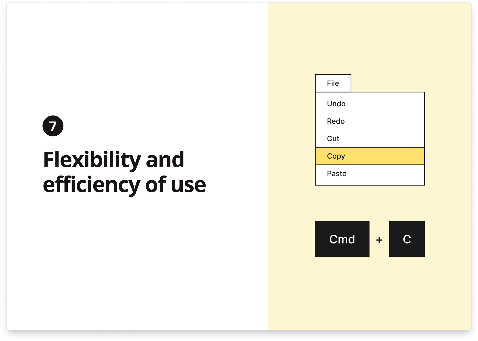
7) Flexibility and efficiency of use
Shortcuts — hidden from novice users — may speed up the interaction for the expert user so that the design can cater to inexperienced and experienced users. Allow users to tailor frequent actions.
Flexible processes can be carried out in different ways so people can pick whichever method works for them.
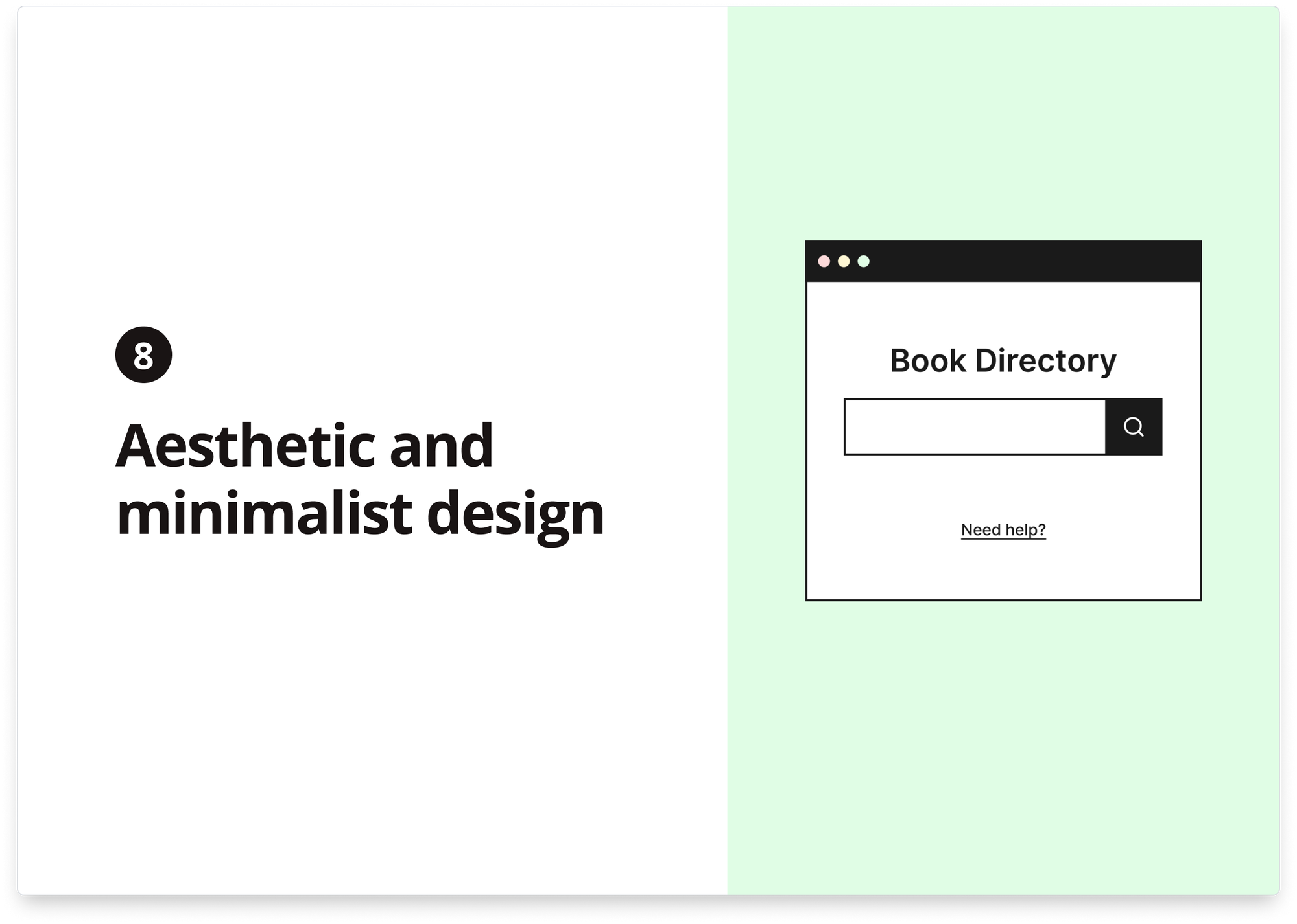
8) Aesthetic and minimalist design
Interfaces should not contain irrelevant or rarely needed information. Every extra unit of information competes with the relevant information units and diminishes their relative visibility.
This heuristic doesn’t mean you have to use a flat design—it’s about keeping the content and visual design focused on the essentials. Ensure that the visual elements of the interface support the user’s primary goals.
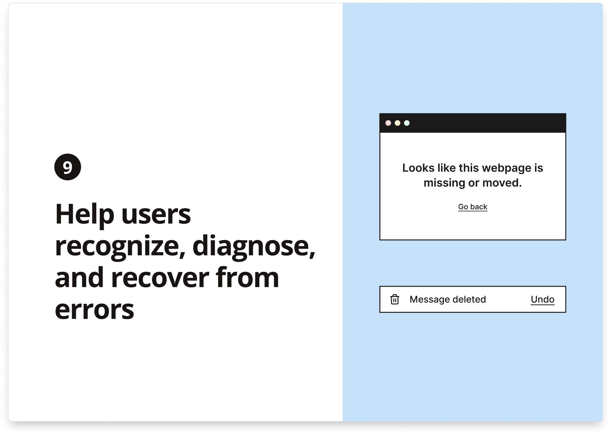
9) Help users recognize, diagnose, and recover from errors
Error messages should be expressed in plain language (no error codes), precisely indicate the problem, and constructively suggest a solution. These error messages should also be presented with visual treatments to help users notice and recognize them.
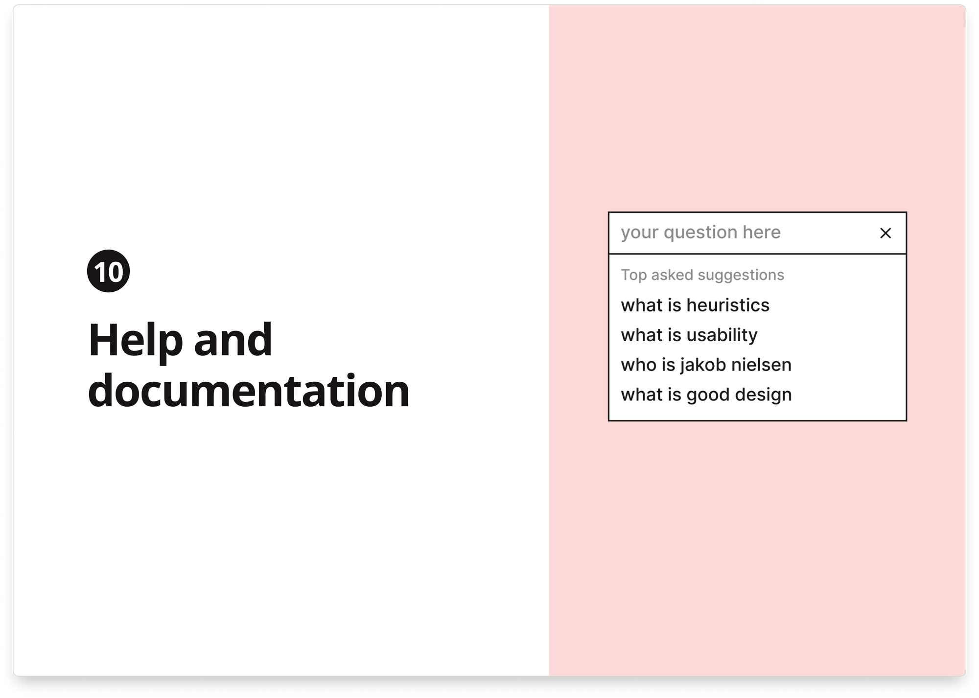
10) Help and documentation
It’s best if the system doesn’t need any additional explanation. However, it may be necessary to provide documentation to help users understand how to complete their tasks. Help and documentation content should be easy to search and focused on the user’s task. Keep it concise, and list concrete steps to be carried out.
Heuristic Evaluation
A heuristic evaluation assesses a product experience in which multiple evaluators (e.g., designers and researchers) review a UI or product experience and record how it violates the established heuristics.
Heuristic evaluations are not intended to replace usability testing or research but can be a cost-effective and time-efficient method of identifying ways to improve the experience.
Heuristic evaluation is a crucial aspect of user experience design that involves assessing a product’s or service’s usability based on predetermined principles. This evaluation method relies on the knowledge and experience of experts in the field to identify potential usability issues and recommend improvements.
Leveraging heuristic evaluation can provide valuable insights into user behavior and preferences, resulting in a more user-friendly and effective product or service. So, if you want to enhance your design process and create products that users will love, heuristic evaluation is worth exploring.